Case Study: Seamless Coffee Ordering & Pickup App
Designed a new mobile experience for effortless coffee ordering and pickup, introducing custom time selection to enhance user convenience.
Role
UX/UI Designer
Industry
Food & Beverage
Duration
2 months

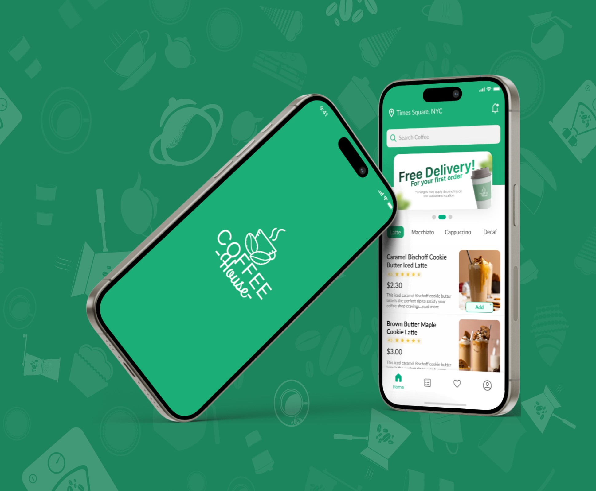


Stage 4. Prototype
Converted concepts into digital wireframes and high-fidelity prototypes using Figma.
Focused on clear structure, minimal steps, and warm visual design.
Core Features
Pickup or delivery selection for flexibility.
Live order tracking with a progress timeline.
Transparent bill breakdown showing taxes and discounts.
Payment method preview before confirmation.
Custom pickup scheduling for convenience.
Animations and transitions were designed to feel smooth and reassuring, giving users a sense of flow and control.


Other projects

Libra Moon App: Serene Interfaces for Astrology & Tarot
Creating a refined and immersive astrology and tarot experience, replicating the tactile feeling of real cards
Graduation project: collaborative learning app design
Revolutionizing the educational ecosystem with a mobile app designed to enhance interactive learning and peer collaboration.